Previously ‘Inactive Items’ displayed in the same format as ‘Active Items’ when ‘Include Inactive’ is enabled from grids in both Professional and Mobile.
This made it difficult to distinguish between ‘active’ and ‘inactive’ items.
Now, from version 20.1.7, if Users are assigned to a Profile that has the ability to “delete”, (this allows them to be able to select ‘Include Inactive’), the items which are ‘Inactive’ will display in the new format; Grey and Italic.
This enhancement is applicable to the following Search Grids;
- Contacts
- Clients
- Serviceable Units
- Jobs
- Tasks
Some examples;
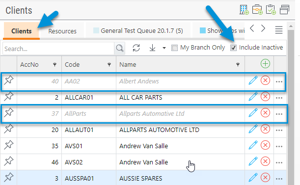
Here, from the Clients Grid, where ‘Include Inactive’ has been enabled, you can see that there are two Clients which show in the new format; grey and italic:

These are the ‘Inactive’ Clients.
The same format applies to Contacts and Serviceable Units Grids.
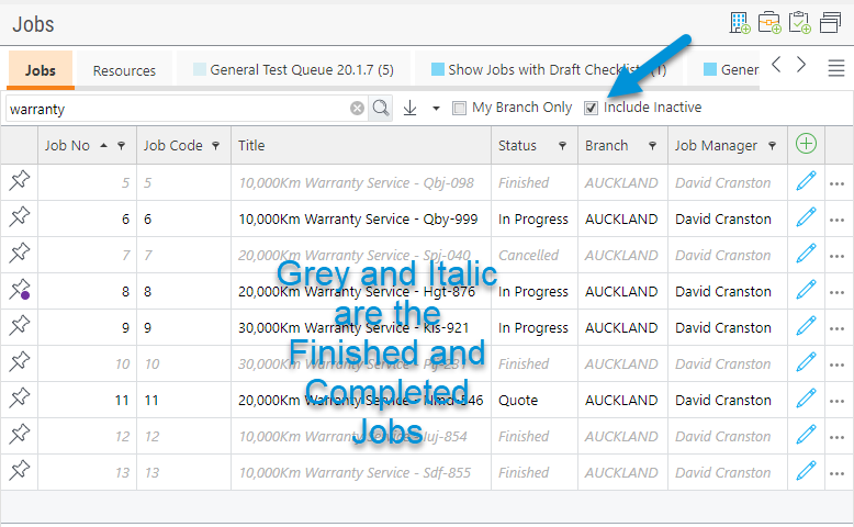
For the Jobs Grid, where a Job has been set to an ‘inactive statuses’ for example; Finished or Cancelled, these will display in the new format when ‘Include Inactive’ is enabled.
Please note, in this example we have completed a search for ‘warranty’ which displays all ‘inactive’ and ‘active’ jobs with that title;

Unless you are searching for a Job No, a minimum of 3 characters is required from Search, otherwise the following icon will display:

In Mobile, the same functionally applies as in this example for the Clients Grid;

The only exception is the Tasks Grid. For Tasks in Professional, you complete a search for ‘Completed Tasks’ from the ‘Task ID’ Search;

Which takes you straight into the Completed Task.
In Mobile, the Task Grid works similar to the other Grids where the ‘Completed’ Tasks display in the new format style when ‘Include Completed’ is enabled;

Items also appear in the new format for Grids as in this example; the Serviceable Units Grid from Client with ‘Include Inactive’ enabled:
